AT HOME
Ecommerce Experience for Home & Furniture
 At Home
THE PROJECT
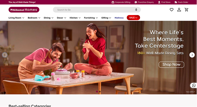
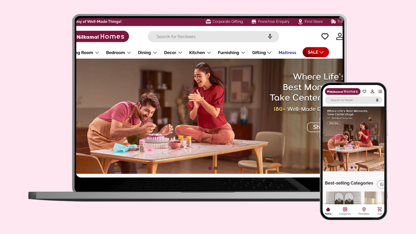
At Home is a home & furniture brand that wanted to move from static catalogue layouts to a modern ecommerce storefront. The brief was to create a soft, lifestyle‑driven interface that still behaves like a serious online store: easy category discovery, fast product comparison, and a frictionless checkout across desktop, tablet, and mobile.
01 Objectives
The primary objective was to design an ecommerce experience that could carry both inspiration and utility. Visitors should be able to browse by room, collection, or campaign while always seeing clear pricing, availability, and add‑to‑cart actions. The site also needed to support merchandising stories for the marketing team without disrupting the buying flow for repeat customers.
02 Challenges
Building a furniture ecommerce storefront came with a few classic UX and technical challenges:
- Large lifestyle imagery had to load quickly on slower home connections.
- Navigation needed to work for both serendipitous browsing and task‑oriented “I know what I want” shopping.
- Filters had to stay readable even with many attributes like material, size, and finish.
- Checkout flows had to work equally well on mobile and desktop without friction.
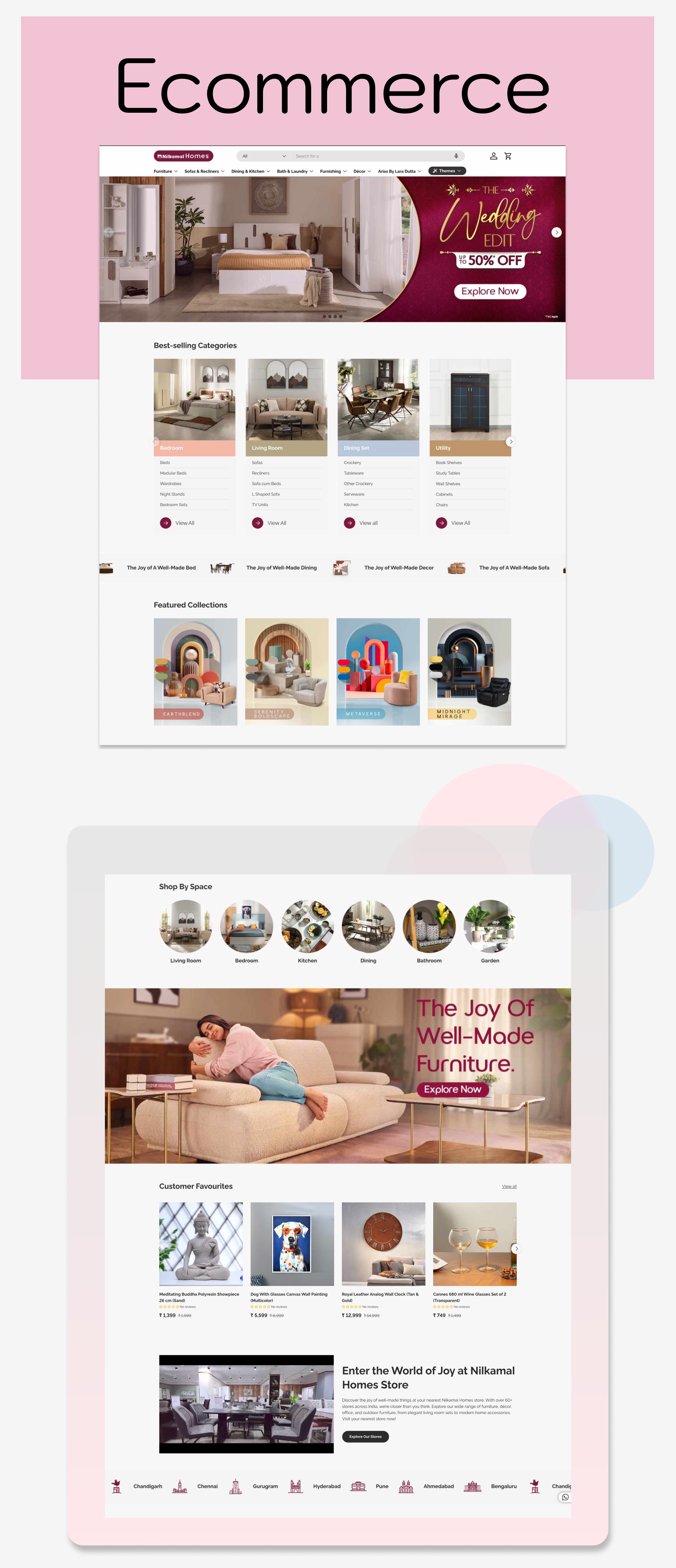
03 Solutions
We combined an editorial hero layout with a structured product grid beneath. “Shop by Space” and “Featured Collections” give quick entry points into the catalogue, while cards, tiles, and product components are all built as reusable blocks so the brand team can launch new campaigns without engineering help. Technically, we focused on responsive grids, image optimization, and SEO‑friendly URLs so the store feels light, fast, and discoverable.